
Designing with Colour

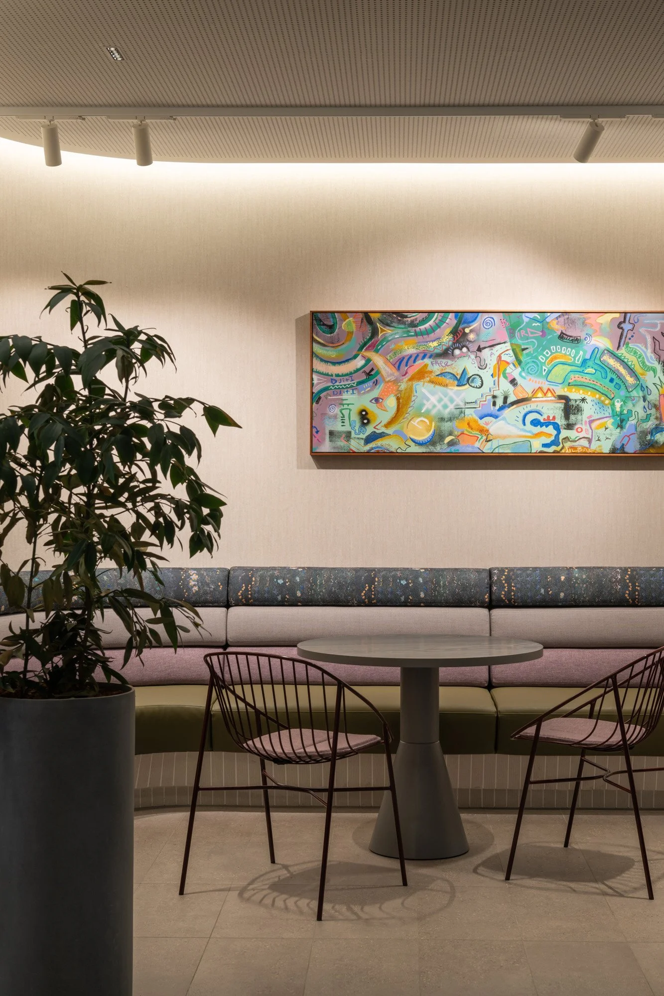
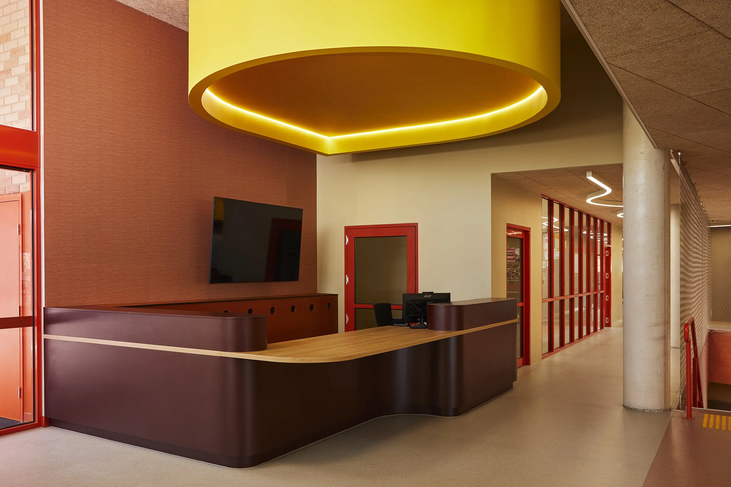
Auburn High School by WOWOWA Architects features Durrmu (KK) by Kathleen Korda in ‘Terra’ on Autex Acoustics x Willie Weston acoustic panelling.
Photo: Martina Gemmola.
Colour has a wonderful ability to define a space in a way few other materials can. Across our favourite standout projects, colour is rarely incidental. Used well, it connects materials, carries stories and gives spaces their identity. Applied with care, bold colour clarifies.
Willie Weston encourages the use of colour with confidence. When translating original artworks into palettes well-suited to the built environment, flexibility and certainty are key.
In this post, Willie Weston founders, Jessica Booth and Laetitia Prunetti, share more about this process. We’ve also included informed perspectives on colour from long-term collaborators Autex Acoustics, and insights from WOWOWA Architects - an award-winning agency widely acknowledged for their bold designs.

Tait’s Breeze Sofa, upholstered in Rainbows ‘Pindan’ outdoor fabric by April Jones. Photo: Dave Kulesza.
Translating artworks into colours suited to interiors
Each Willie Weston design begins as an original artwork. Translating these works for interior use requires care and restraint. During the process, we prioritise colours that will offer complementary but unique counterpoints within contemporary interiors. We also consider how successfully colours will repeat, sit across larger surfaces, and work alongside other materials.
This translation process takes place in close consultation with artists and art centres, ensuring the integrity of each artwork is maintained, while making it suitable for a variety of applications and settings. Drawing on her experience working with art centres prior to founding Willie Weston, co-founder Jess Booth brings a deep understanding of how to balance commercial requirements with the artist’s intent across the collection.
“Over time, we have developed an eye for developing colour for contemporary interiors.”
— Jessica Booth, Willie Weston
Singing Bush Medicine by Colleen Ngwarraye Morton in ‘Night Sky’ forms part of an inviting colour palette in this office design by Woods Bagot. Photo: Dion Robeson.
Colours and pattern shaped by place
During this detailed process, we consider the landscapes, environments and stories that inspired the original artworks. This connection gives each palette a sense of cohesion and authenticity, while making it intuitive to use across interiors. Pattern also comes into play here, as we intentionally select colours that will allow various patterns to sit alongside each other across the collection.
“Our designs are not just patterns to us - they are original artworks, containing culture and community, that we value and want to share.”
— Laetitia Prunetti, Willie Weston
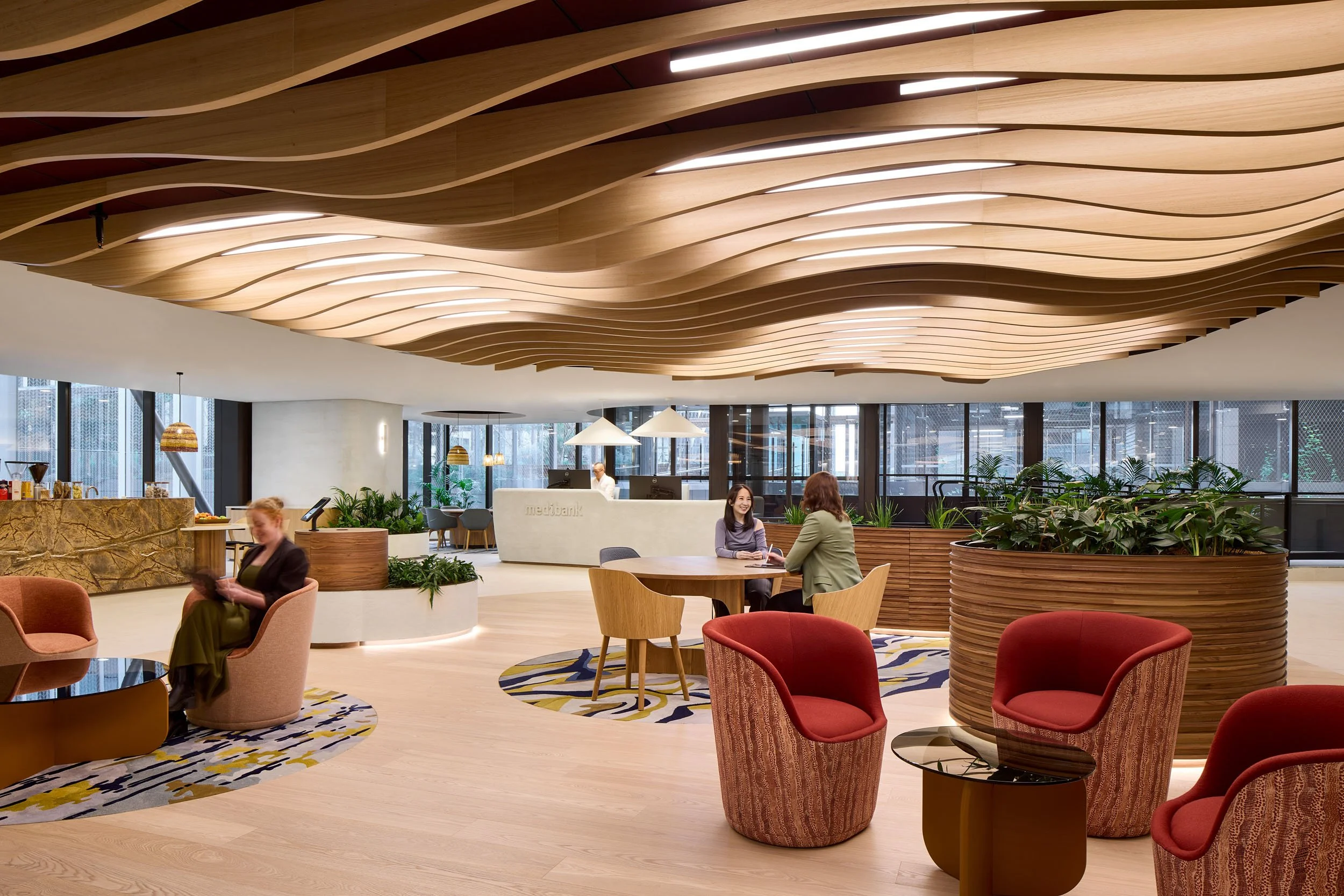
Willie Weston’s Durrmu (LB) design by Leanne Black in ‘Geo’ features at Medibank Melbourne, by Gray Puksand. Photo: Tatjana Plitt.
Rather than competing with other materials, we select colours that sit comfortably alongside timber, stone, metal, fresh whites and neutral surfaces. The final colours work beautifully on their own and even more effectively when layered together, giving designers freedom to create spaces that feel considered, balanced and resolved.
This environmental grounding is one of the reasons Willie Weston textiles integrate so seamlessly into material palettes. The relationships between colours are already resolved, giving spaces clarity and cohesion.

Durrmu (KK) in ‘Terra’ by Kathleen Korda in the Gold Class carriages of Journey Beyond by Woods Bagot. Photo: Nicole England.
Specifying colour with confidence
Used strategically, colour goes beyond decoration to create mood, connection and a clear sense of identity. Willie Weston textiles can complement a bold palette or work more subtly within a material selection, helping to create spaces that are both striking and functional, and aligned with their intended purpose.
To explore how colour and pattern can be used with confidence, we spoke with long-term collaborators who integrate Willie Weston designs into their work. Autex Acoustics brings a deep understanding of how coloured and patterned acoustic surfaces can balance energy and focus within a space, including through the Willie Weston x Autex Acoustics Collection.

Mud Ripples in ‘Wild Red Apple' by Elizabeth Kandabuma features on custom upholstery at the Melbourne Indigenous Transition School (MITS) boarding house, by McIldowie Partners. Photo: Tom Ross.

Sugarbag Dreaming in ‘Ghost Gum’ by Rosie Ngwarraye Ross on Autex Acoustics x Willie Weston panels.
“Colour and pattern have the ability to do much more than decorate a space – they can define zones, add depth, and create a sense of movement and texture. Within the Autex Acoustics x Willie Weston collection, colour becomes a powerful design tool that allows commercial interiors to feel layered, expressive and confidently resolved without compromising the functional needs of such environments.”
— Tamara Isaac, Autex Acoustics
WOWOWA Architects are recognised for their confident, award-winning use of colour, including on projects such as Auburn High School (2025). Incorporating several designs from the Willie Weston x Autex Acoustics collection, their work on this project demonstrates how colour, when applied with intent, can shape experience and bring clarity to complex interiors.
By bringing colour in early and using it with intention, designers can transform interiors into spaces that feel deliberate, engaging and harmonious. The Willie Weston colourways make this approach achievable, providing a palette that works across materials, scales and applications, while remaining true to the original artwork.
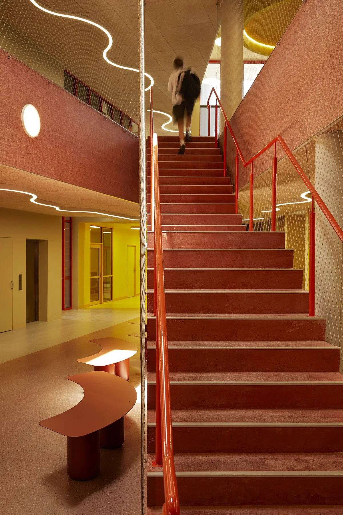
Durrmu (KK) by Kathleen Korda in ‘Terra’ acoustic panelling at Auburn High School by WOWOWA Architects. Photo: Martina Gemmola.
“It was our honour and delight to feature Willie Weston acoustic panels throughout Auburn High School to create calm spaces that felt rich in colour, texture and thoughtfulness.”
— Monique Woodward, WOWOWA Architects
Renewed by Lisa Waup in ‘Grevillea’ has been included in the project on Autex Acoustics x Willie Weston acoustic panels. Photo: Martina Gemmola.